TIME PERIOD: October 2019 – May 2020
CLIENT: The National Library of Israel
ROLE: Lead Product Designer, UX, UI, prototyping, visual research, mockups
LINKS: Live Desktop Prototype Mobile Prototype
CASE STUDY
The National Library of Israel – SITE Architecture
Revised and rebuilt the site architecture, with an SEO-first strategy
OVERVIEW
As part of this challenging project, I worked with the Product Manager to conduct user research, analyze customer feedback, and conduct card-sorting sessions.
Following that, I led the studio in designing several versions based on the results of the user research.
UX CHALLENGES
Up to this day, the library used inconsistent, outdated, and hard to navigate menu. Some of the problems:
❌ There were two different menus co-existing on the site
❌ Unorganized and confusing categories
❌ Confusing copy, lots of internal terminology and naming
❌ Basically, “the one who knows, will find the way”. The one who doesn’t will just bounce to something else
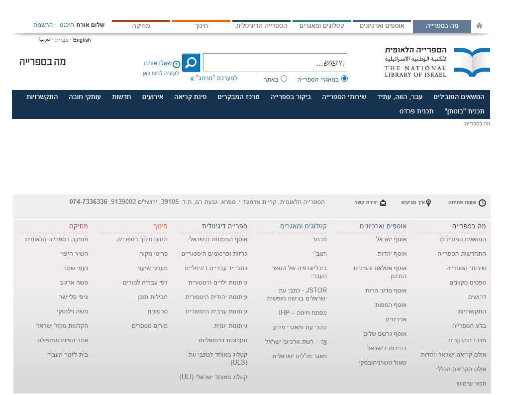
OLD MENU + FOOTER #1
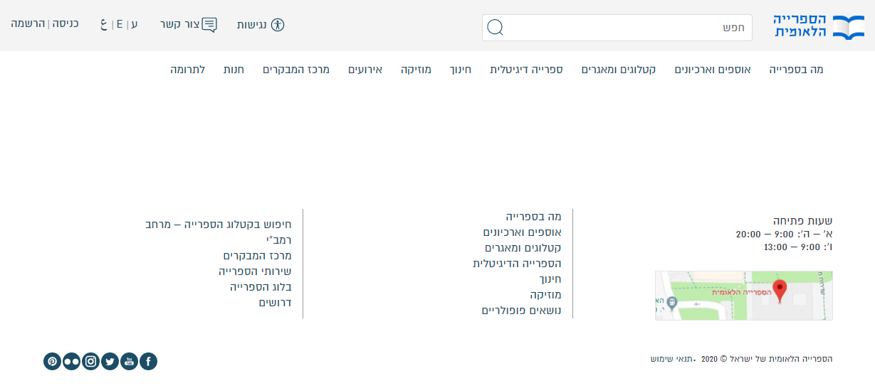
OLD MENU + FOOTER #2
GOALS & OBJECTIVES
Some of the goals set:
🎯 Simplicity
🎯 Fewer categories, more logical organization
🎯 Expose different formats and themes
🎯 Serve both power- and new users
🎯 SEO: Better exposure in Google, transfer the new site map
🎯 Copy revision
METHODS WE USED:
-
Competitive/Comparative analysis
-
Card Sorting
-
User interviews
-
AB pilot
-
Evaluation
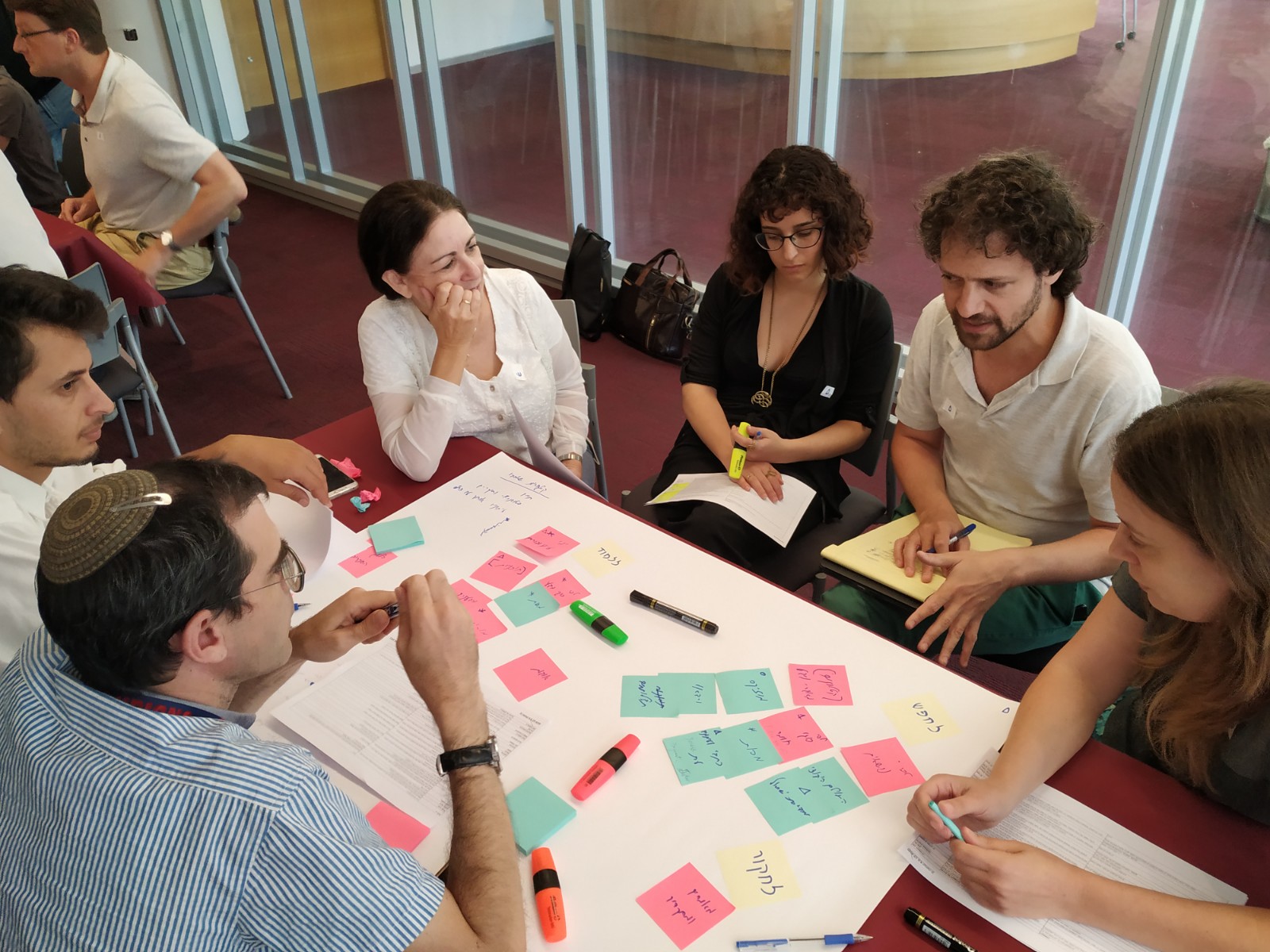
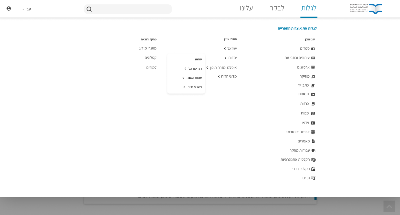
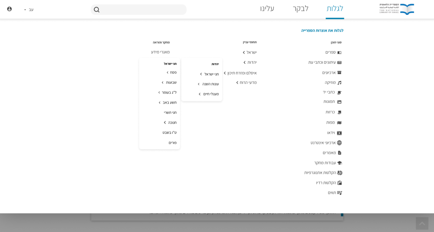
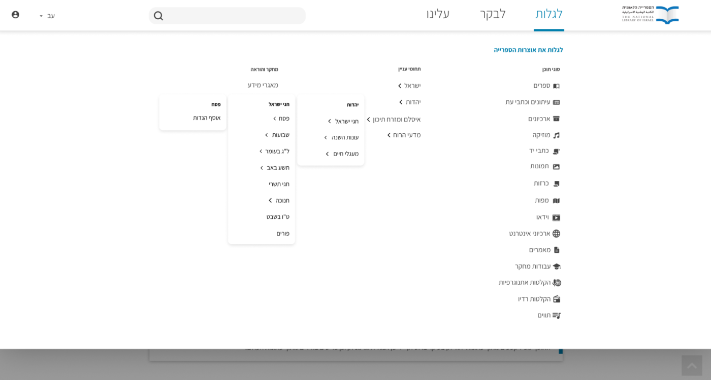
UX WORKSHOP – CARDSORTING
Our department initiated a UX workshop within the organization.
We have set card sorting session within the organization with 30 motivated representatives, divided into 4 workgroups.
The session was a mix of open and closed methods: the main categories were given, and the sub-categories were to be decided by the participants based on their acquaintance with the website.
The main categories were:
-
Resource types (“Formats”)
-
Themes
-
Teach
-
Research
-
Visit
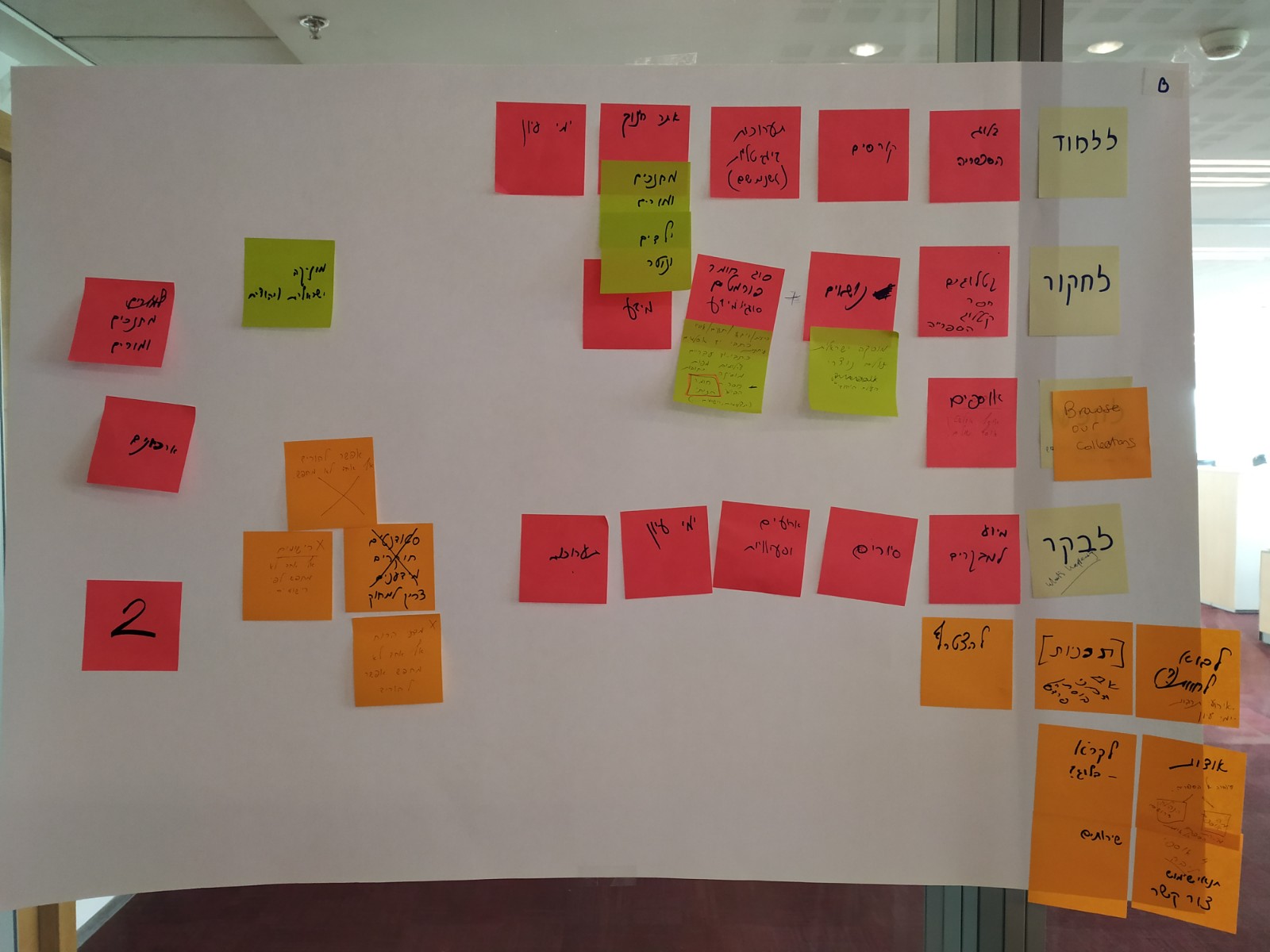
ONE OF THE GROUPS BOARD
GROUP DISCUSSION
USER INTERVIEWS:
After evaluating the workshops’ results, two work options were developed, A and B, with 3 and 5 main categories accordingly.
Design challenge: the menu should support up to 5 levels of sub-categories.
Our PMs went to one of the most crowded places in Israel – Azrieli Mall – in order to get as diverse audiences as possible.
Altogether,
-
30 users were interviewed – they were from all over Israel, and even someone from USA
-
They’ve been asked to perform typical tasks regarding finding different types of information through the menu.
E.g.: genealogical research, book order, information on historic personality, and more -
In the end, they were asked which option they prefer and been asked to explain why.
The results were ambiguous, and we decided to move forward with both options,
and check them both again within the organization.
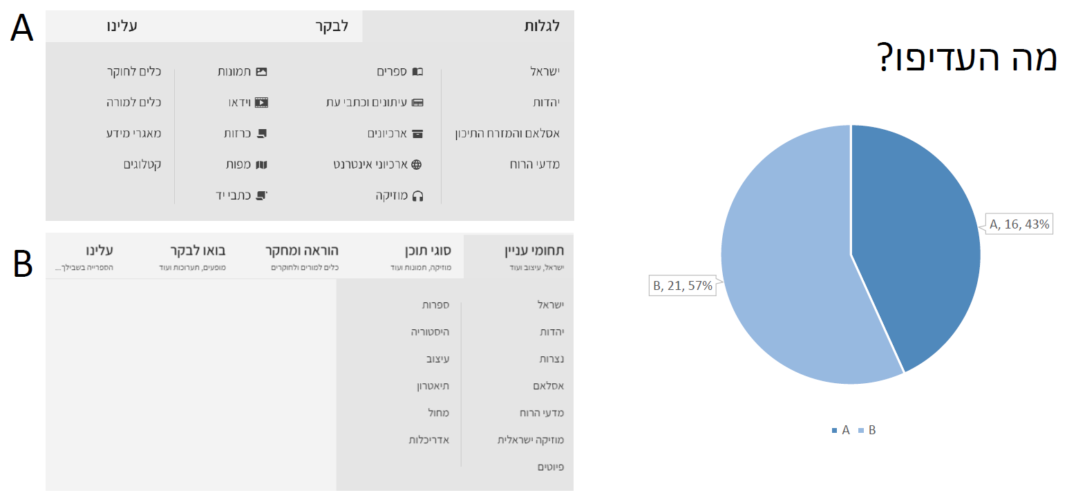
OPTION B SLIGHTLY OUTPERFORMING A
DESIGN ALTERNATIVES
OPTION 1 – SIDE MENU
An open-from-the-side type of menu, which offers lots of space to open the sub-categories.
The markers show your path.
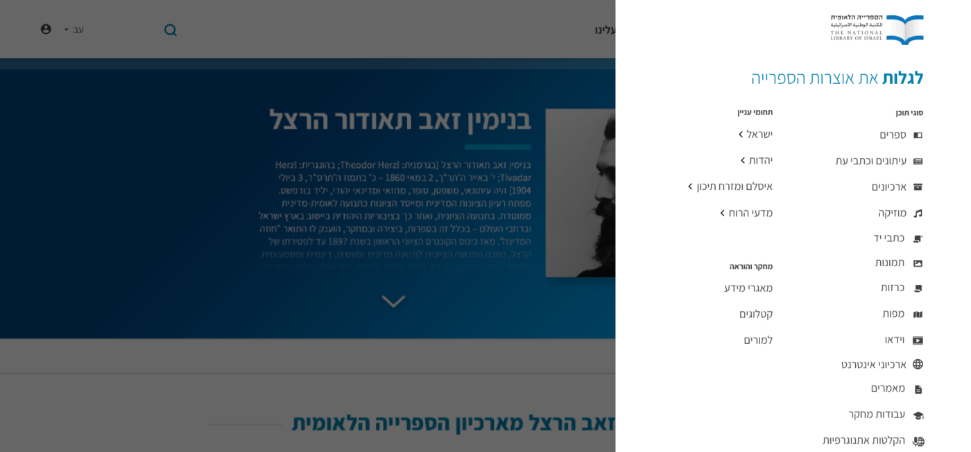
OPTION 1 – SIDE MENU
OPTION 2 – FOLDERS
This option is based on a reference of opening folders in browser (bookmarks): each sub-level will open to the side of the previous as an overlay the size of its contents.
OPTION 2 – BROWSER MENU
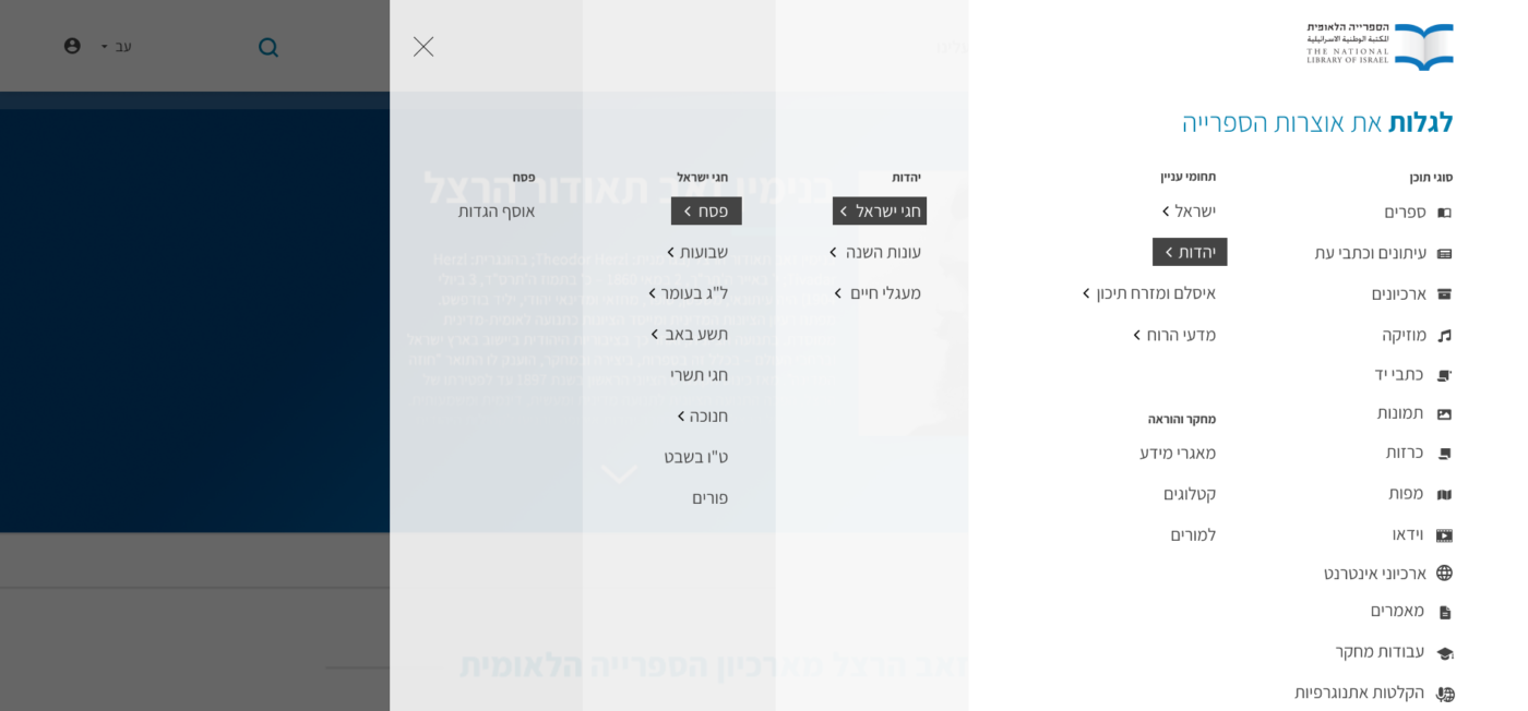
OPTION 3 – “BREADCRUMBS”
Additionally to opening the sub-level on the side, and marking the path with color, we added the path of “breadcrumbs” on the top, which will help to understand the user location & navigate back.
OPTION 3 – “BREADCRUMBS”
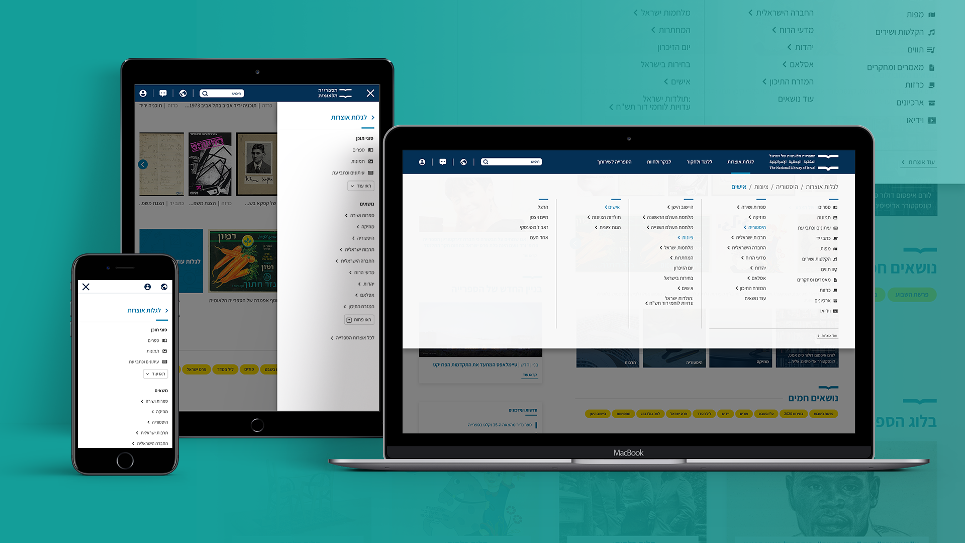
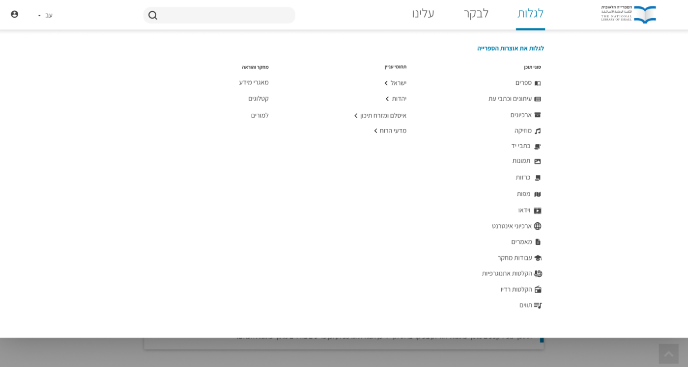
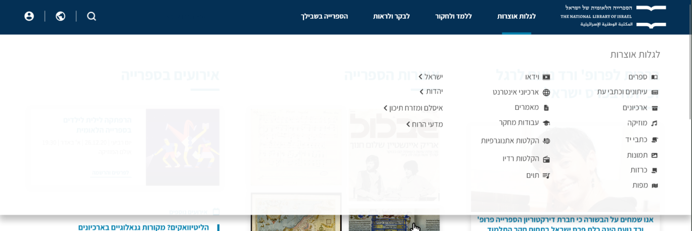
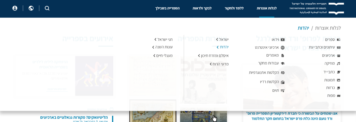
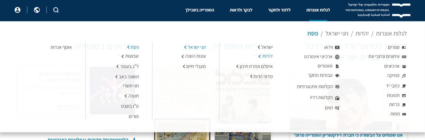
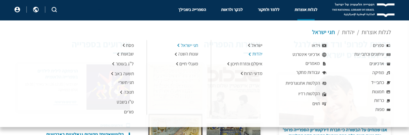
FINAL VERSION
We decided to compromise between option A (3 main categories) and option B (5 main categories) and merge “Formats” and “Themes” into one “Explore” category.
This decision was backed up by our ongoing work with Library’s departments, collecting and refining their needs.
Another requirement that arose here was to highlight the services, that Library provides, both physical and online. So, additionally to the service/chat button that is always visible in the sticky menu, we used the free space provided by the chosen design option to put bold CTA items inside the menu supported by icons.
The same idea was used to promote the Library’s events, using big bold banners inside the menu.
NLI MEGA MENU – FINAL VERSION
MOBILE VERSION
We have tested placing the menu at the bottom of the screen, as we found in research and references that this is an easier place to operate since the thumb finger is easier to press while holding the phone.
As well as being a convention for mobile applications, the site will also look more modern and contemporary.
Eventually this idea was argued because we had pages with sticky-bottom CTA and it will conflict with each other.
MOBILE – BOTTOM MENU IDEA
FINAL MOBILE VERSION
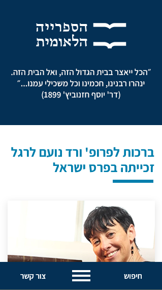
The final version was chosen to be more conventional top hamburger position, with most demanded actions outside: search, help and homepage (logo).
When open, there are:
-
Always-on-top links to profile (login/registration) and language settings
-
Four main categories, with sub-categories each on its own page
NLI MOBILE MEGA MENU – FINAL VERSION