TIME PERIOD: February – October 2021
CLIENT: The National Library of Israel
ROLE: Lead Product Designer, UX, UI, prototyping, visual research, mockups
LINKS: Beta version (live)
CASE STUDY
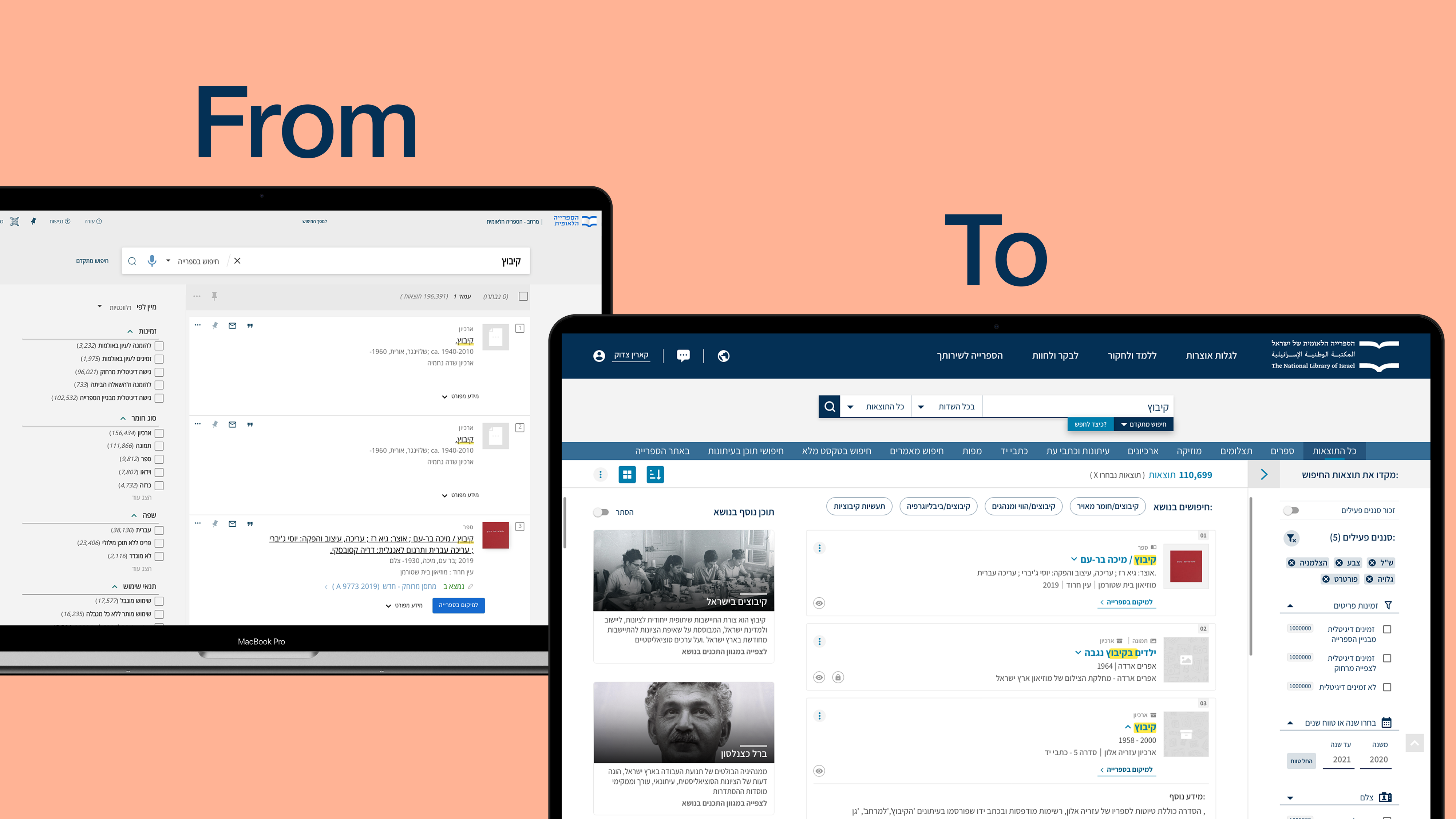
The National Library of Israel – Search Engine Redesign
Redesign for the National Library search engine – the “heart” of digital library
STARTING POINT
To begin with, search lies in the heart of the library as a digital archive and its mission for accessible digitized materials. I believe that in our new digital era search experience is a deal-breaker for Libraries.
GOAL
Currently, the Library uses “Primo Ex-Libris” OTB solution, with some little tweaks done throughout the years, as the main catalog search engine. That was our main starting point, and the goal was to improve the UI and UX of the OTB experience, based on the user feedback, align it with the new Design System, and launch a beta version to navigate at least 5% of the overall traffic to these new pages for further testing.
USER RESEARCH
The goal of PM’s user research was to understand what works on our current search page and what does not. We later worked together to leverage the research results and provide the best UX solution.
The research included two parts, a satisfaction survey, and an in-depth questionnaire. Overall, 592 users took part in the surveys, and 76 of them answered the in-depth questions.
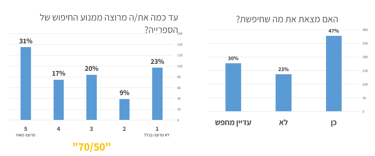
THE AVERAGE SATISFACTION LEVEL WITH THE SEARCH EXPERIENCE IS MEDIUM (3.3), 50% COULDN’T FIND WHAT THEY WERE LOOKING FOR
Here are some if the user feedbacks:
“Is the book [X] digitally readable?”
“There is an online book, but it says I can not view it because I do not have permission! So why are you putting it in the catalog? For beauty?”
“There is no way to browse through author lists, which makes it very difficult to find a particular author whose last name is known but whose first name is unknown.”
“The spaces between the items and the rows are very large, and you have to scroll a lot to get to the items. In my opinion (and I work and have worked with five library programs) it’s better to have more items on the page…”
“Sometimes you have to try a lot of keywords to search to find a result that was supposed to be available in the keywords you tried before”
KEY RESEARCH CONCLUSIONS
Satisfaction
-
Average level with the search experience is medium (3.3)
Search properties
-
Users of the in-depth survey, mostly researchers, do look for books, but also for other relevant materials (no longer just books!)
-
Users are equally divided between those looking for a particular item and those looking for items on a particular topic, and both scenarios need to be addressed
-
There is still a demand for catalog information – about 40% of those who responded to the in-depth survey searched for this type of information for various uses (not just “planning a visit” to the library)
Usability
-
Users wanted to see more results without the need for additional loading / browsing, and to get more information on the screen to save scrolling
-
Inquiry for less “sensitivity” to typos
UX GOALS
Some of the operative goals that we set to address in design and specifications, based on the research conclusions:
- Creating a new and improved search interface, which allows for a quick visual scan and adapted to the different types of material
- Improving predefined search capabilities (author only, title only) through autocomplete
- Reducing and improving search filters
- Consolidate all the materials into the main search
- Improving the accuracy of “online access” mark
- Improving the sorting of results (Ranking mechanism)
- Improving topic-based search capabilities (suggesting more topics, auto-completion)
- Combining different types of results (events, blog articles) with minimal damage to the “cleanliness” of the results page
- Improving existing morphological mechanisms (Morfix)
MAPPING EXISTING FEATURES + EXAMINING OPTIONS FOR ADDING NEW
Together with PM we worked on the feature table, to better understand the scope of work and the functionality of each single feature, both existing and the ones we wanted to add.
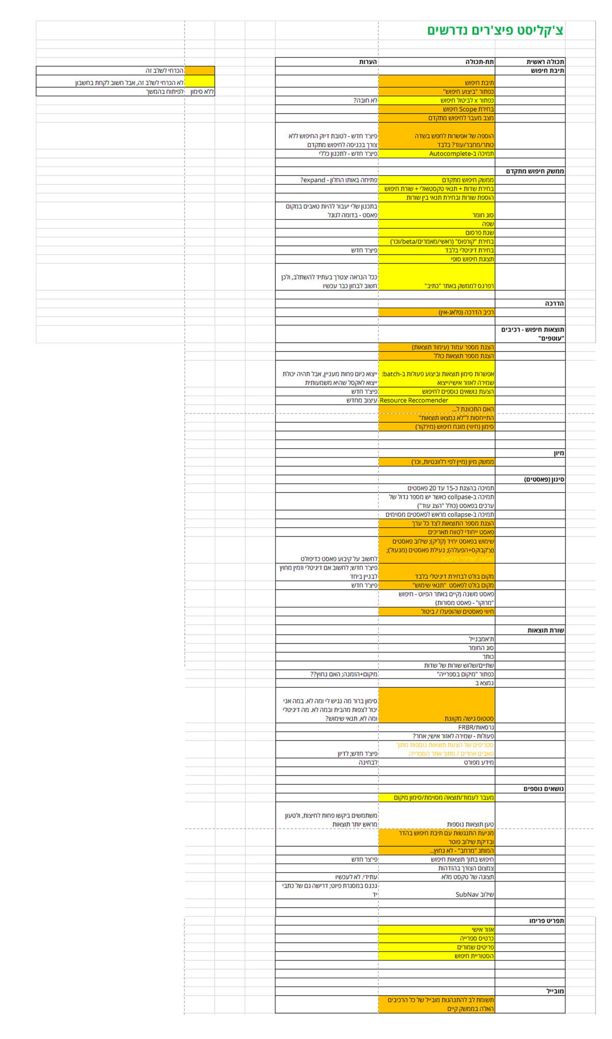
FEATURE TABLE
COMPETITIVE RESEARCH/BENCHMARK
Parallel to mapping features, I went through around 30 result pages of online digital archives and libraries, and also big e-commerce websites to check various solutions they provide that enrich search experience. And of course, our ultimate reference was Google.
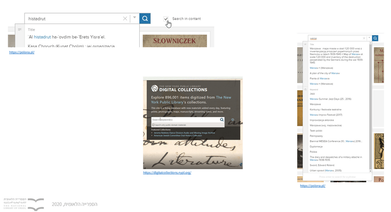
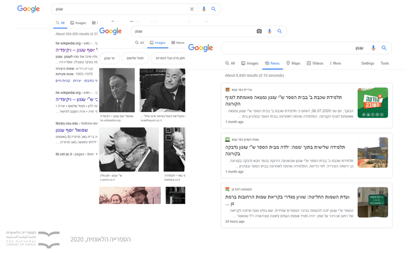
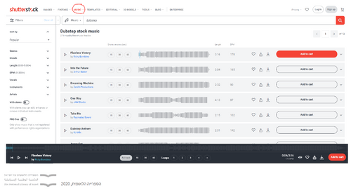
VARIOUS SEARCH SOLUTIONS
BENCHMARK HIGHLIGHTS
-
The most common way to display different type of results was tabs
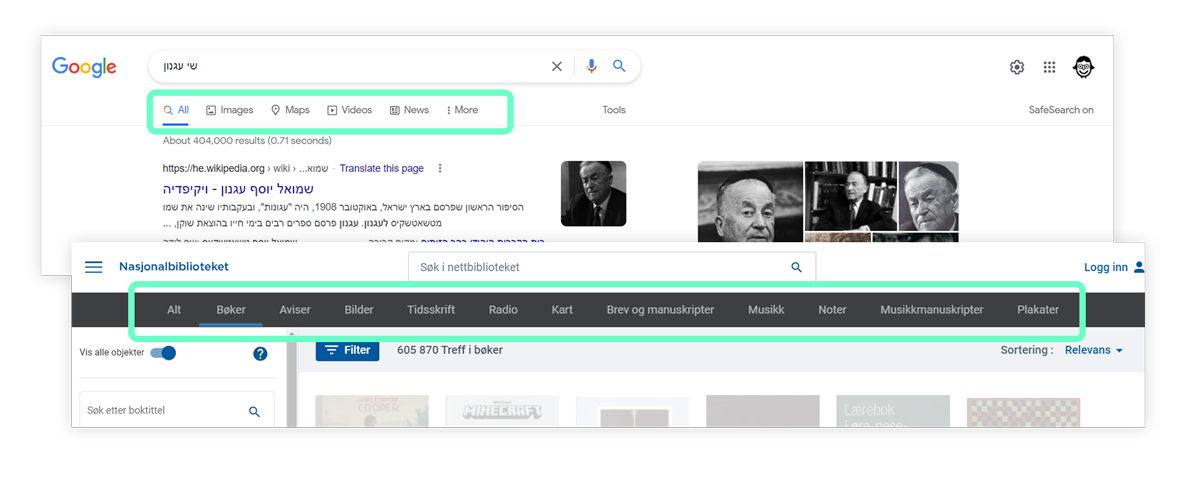
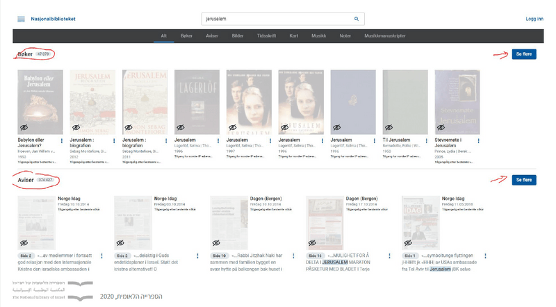
GOOGLE AND THE NATIONAL LIBRARY OF NORWAY RESULTS PAGE
-
Online access – one of the ways to highlight this feature is to put it on the first place above all of the filters, like the Library of Congress does
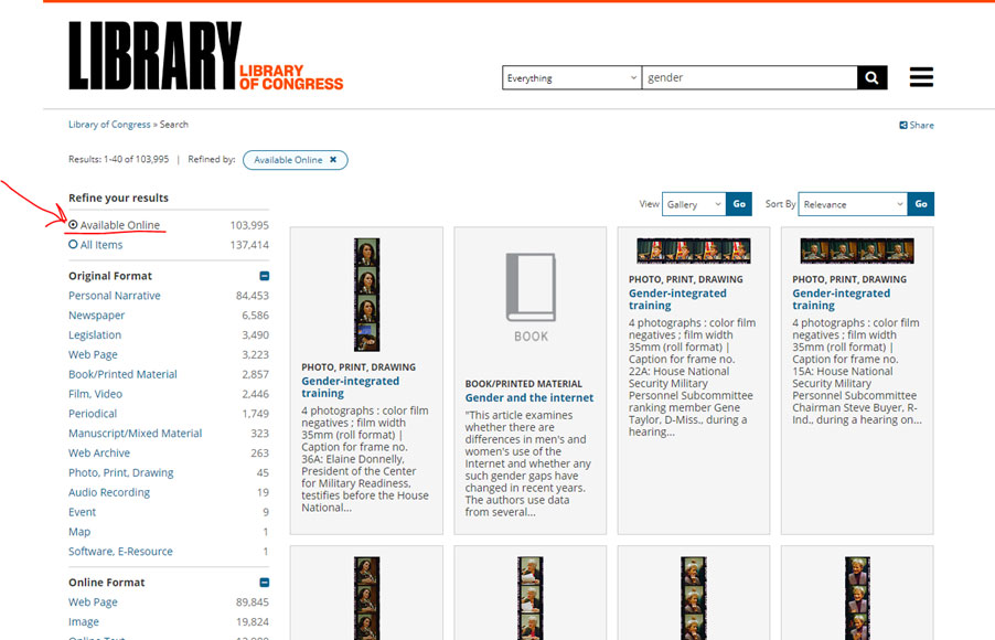
LIBRARY OF CONGRESS
-
Filters position and behavior – Ebay and Amazon probably have a good reason for placing filters in scrollable strips (my assumption: provides greater discoverability).
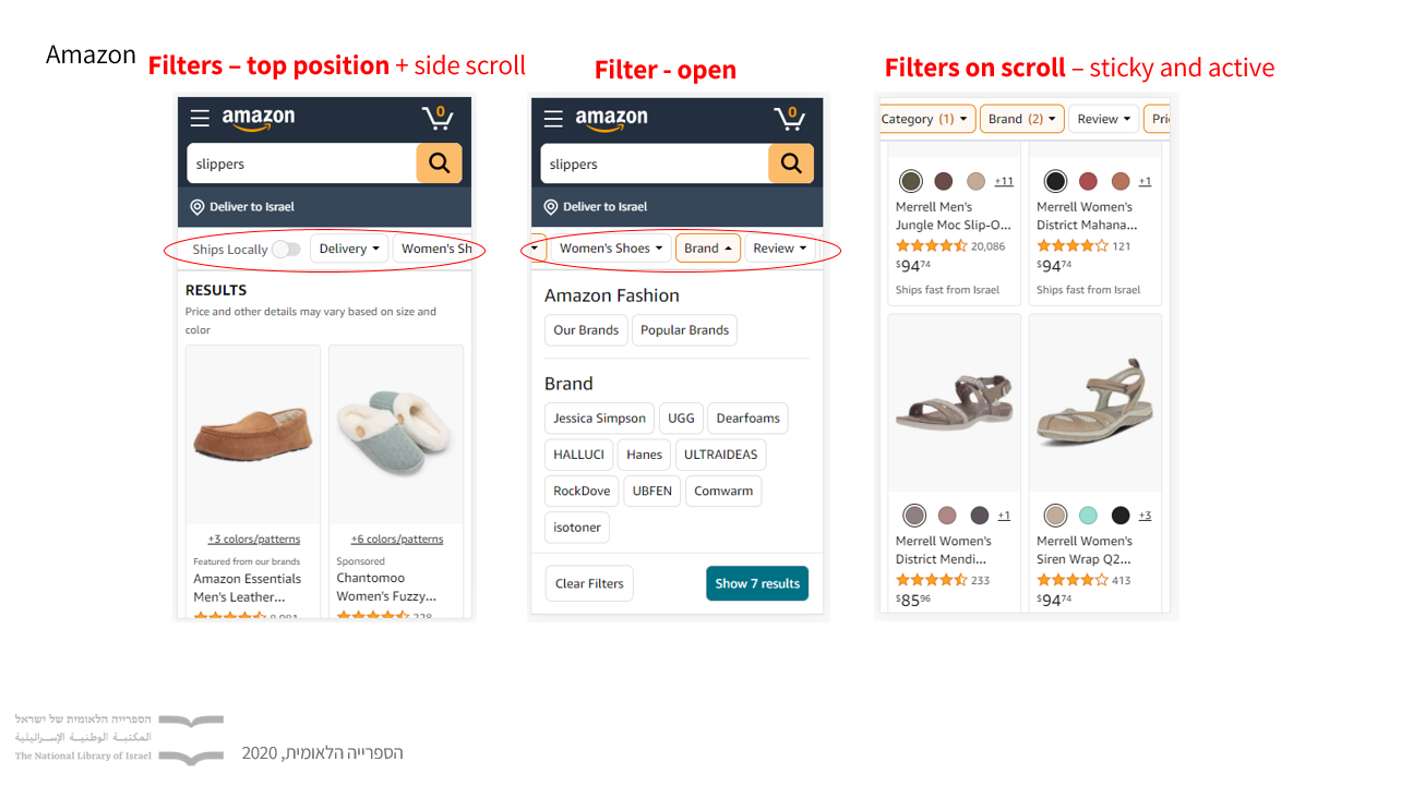
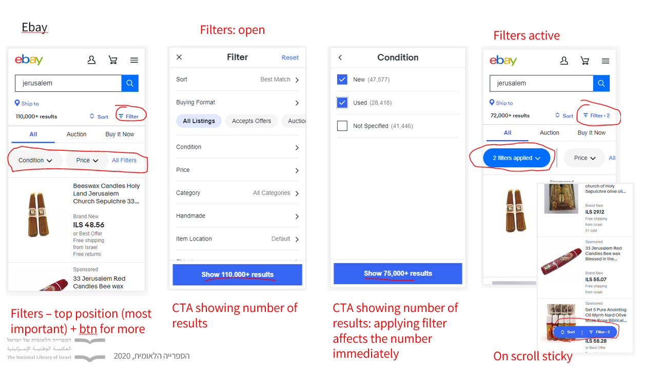
AMAZON & EBAY – MOBILE FILTERS POSITION AND BEHAVIOR
DESIGN EXPLORATIONS
We have explored two major design versions:
A – Filters on the top of the page very close to the search bar.
B – Filters in a sidebar.
VERSION A — WITH FILTERS BELOW THE SEARCH BAR. THIS POSITION SUPPORTED BY ICONS PROVIDE GREATER DISCOVERABILITY OF THE FILTERS
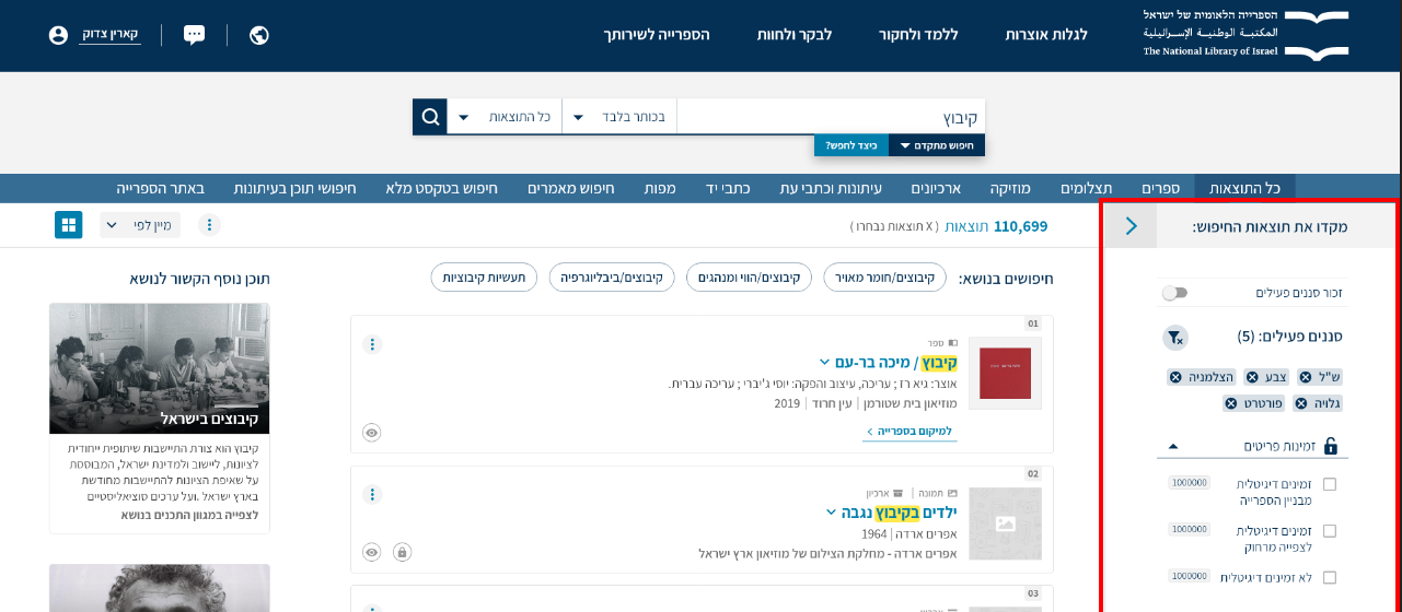
VERSION B — FILTERS SIDE-BAR, ALLOW PLACING LARGE AMOUNT OF FILTERS WITHOUT MAKING USERS WORK TOO HARD TO GET TO THEM
UX IMPROVEMENTS
-
Search based on different formats (each time the results page and cards will adapt accordingly, e.g. big thumbnails and grid for visual results.
-
Smart search suggestions.
-
Enlarged thumbnails for list view.
-
Ability to see copyright restrictions/digital access.
-
Mark and save searches in your personal area.
-
Contextual suggestions for materials from Library’s articles.
-
View display toggle (grid / list).

MAIN UX IMPROVEMEENTS
After presenting the design alternative to the various stakeholders and in parallel
with the survey we conducted regarding which of the alternatives the users prefer,
alternative B was chosen.
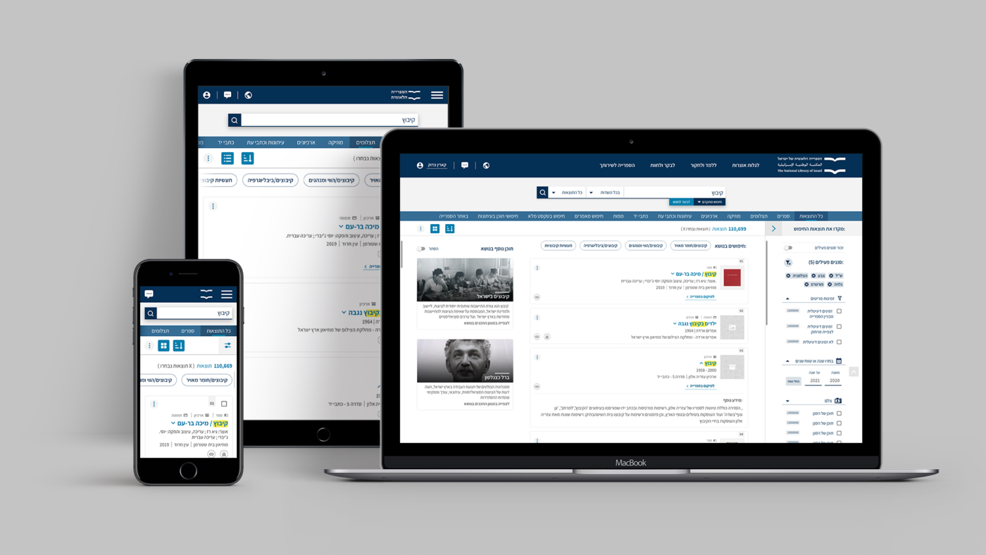
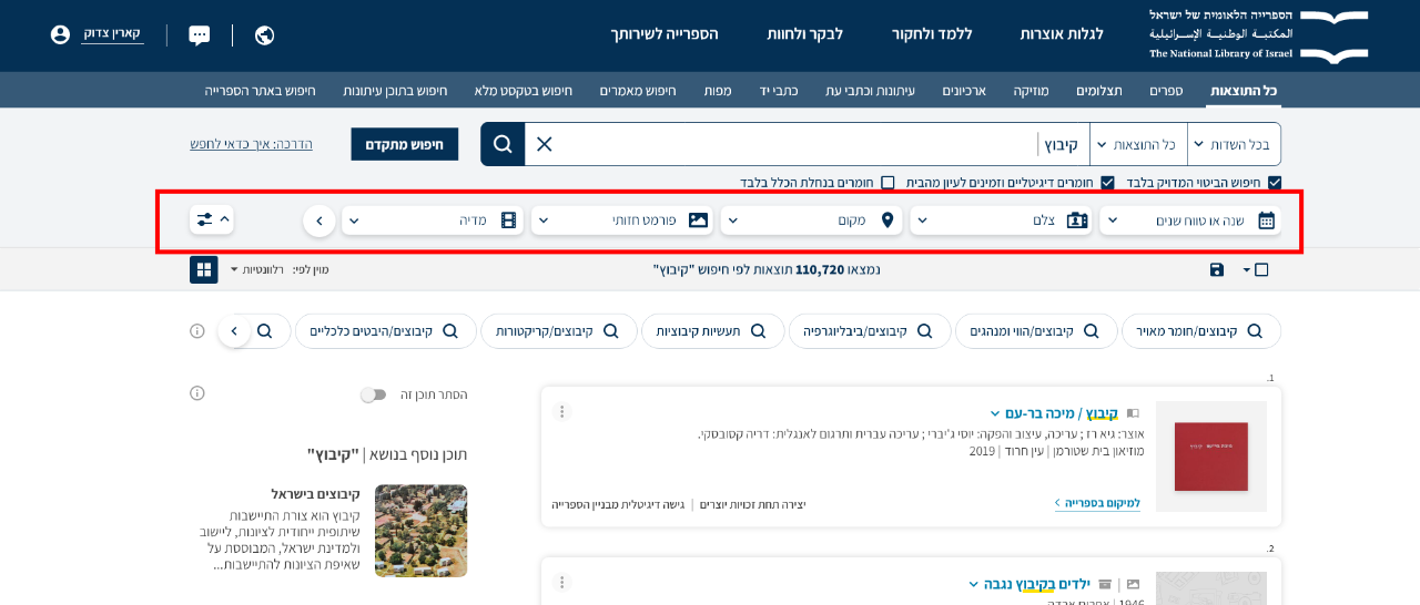
OPTION B – THE FINAL DESIGN IN DESKTOP, MOBILE AND TABLET SIZES